Pulling from logo warehouses or crowdsourcing design may sound tremendously appealing for filling in the blank spot on the top of your letterhead.
You want something trendy and cool, even if it’s just to check off a task on your to-do list.
It doesn’t make sense for a company to use a logo that has an immense lack of understanding. A logo alone isn’t the solution to developing a strong brand. Strength comes from understanding company culture, which is a giant part of a larger brand strategy. Understanding provides an opportunity to develop cohesive and consistent messaging. This requires customization, knowledge and skill. RED has acquired all the skills needed to build you a solid foundation that is not hollow and inauthentic.
Fruit of the Loom is ‘Pretotyping in a Pop-up’ to Concept Test Premium Brand
Shoreditch, London – home of hip. That’s where t-shirt brand Fruit of the Loom is concept testing (or ‘pretotyping*’ to use the jargon) a new premium brand – ‘Seek No Further‘.
Pretotyping: Testing the initial appeal and actual usage of a potential new product by simulating its core experience with the smallest possible investment of time and money.
Pretotyping In a Pop-up = Awesome Concept Testing
Renting an unused retail space just for four months, Fruit of the Loom is testing for consumer appeal with a very limited run of garments. There’s one in Shoreditch, and one in Berlin – and a pop-up website.
This is concept testing done right – there’s a world of difference between seeing words on a page and experiencing the product – so could pop-up + pretotyping be the future of concept testing?
Last year I wrote a Year in Review article that mainly focused on Facebook: 20 Changes Facebook Made In 2012 That Impacted Marketers. I mentioned, “Facebook was all about refinement in 2012.” If “refinement” was the word of 2012, “streamlined” was the word of 2013.
And this year I want to focus on the broader options that social marketers have at their disposable now.
An influx of new top tier social networks spread user attention thin in 2012 and required a renewed emphasis on key features and functionality.
In 2012, Facebook was on top of the mountain.
It was still the 800-pound gorilla in 2013, but a variety of other networks took their shots at prominence and deserve our attention as well.
Here are the top social media changes and trends introduced in 2013 and the last 12 months.
The Growth of Short Video
Twitter started the year off with the launch of Vine, a mobile service that lets you capture and share short looping videos. Twitter noted on its blog that, “the brevity of videos on Vine (6 seconds or less) inspired creativity. Now that you can easily capture motion and sound.”
Vine saw 403% growth between the first and third quarters of 2013, making it the fastest-growing app of the year. And then Instagram launched video…
Instagram added fifteen-second video functionality on June 20. The number of Vine video links shared to Twitter dropped nearly 40 percent that day. Vine sharing on Twitter continued to drop over the following week, resulting in a roughly 70 percent drop from the nearly three million links shared on June 15. Instagram jumped on the video hype by announcing sponsored ads on October 3.
Facebook learned from the success of Instagram’s video ad integration by rolling out auto-play video ads on December 17, 2013. According to Facebook, the social network began testing auto-play video ads in September and the changes resulted in a more than 10 percent increase in video views, likes, shares and comments.
Twitter Jumpstarts Monetization
In 2012, Facebook’s IPO helped fuel an increased focus on revenue generation. Following a similar course in 2013 Twitter launched their IPO and subsequently increased advertising options.
On May 22, Twitter introduced Lead Generation Cards to help B2B brands drive highly qualified leads. According to Twitter, “These cards makes it easy for users to express interest in what your brand offers. Users can easily and securely share their email address with a business without leaving Twitter or having to fill out a cumbersome form. When someone expands your Tweet, they see a description of the offer and a call to action. Their name, @username, and email address are already pre-filled within the Card. The user simply clicks a button to send this information directly (and securely) to you.”
Twitter also integrated previews of photos and Vine videos directly into users’ streams on October 29. Users see more of the photo or play the video by tapping the preview.
As a result of Twitter’s focus on advertising, the platform saw a 22 percent increase in small business usage.
Pinterest Gets “Rich”
Pinterest helped marketers answer the question, “What are people pinning from my websites?” by launching Web Analytics for verified business accounts on March 12. The free Web Analytics platform helped marketers see Pinterest metrics in categories including Site Metrics, Most Recent, Most Pinned and Most Clicked.
Pinterest introduced Rich Pins on May 20. Instead of linking back to the pin’s origin, each new Rich Pin provides users additional information about that item aimed to better put them in a position to make a purchase. There are three different types of Rich Pins, each with its own unique set of characteristics and opportunities for brands: Product, Recipes, and Movies.
For items like clothes and furniture, the new Product pins offer real time pricing, availability, and where to buy the item. Recipe pins allow brands to provide information like cook time, ingredients, and servings to help foodies and food bloggers create new creations using branded pins. Movie pins contain content ratings, cast members, and more designed to provide a new layer of information about these movies.
On September 19, Pinterest announced it would roll out Promoted Pins as its first advertising product with select partners. Promoted Pins allow businesses to insert pins into search results and category feeds similar to sponsored advertising options offered by social networks like Facebook and Twitter. Promoted Pins started to appear in users’ feeds in early October.
LinkedIn Grows as a Content Portal
LinkedIn expanded its business offerings through the launch of Showcase Pages on November 18. Showcase Pages are dedicated content hubs enabling businesses to extend their Company Page presence, effectively segmenting audiences and enabling businesses to deliver the best message to the right audiences. Somewhat similar to LinkedIn s existing company pages, Showcase Pages are designed to give individual brands and business units within corporations the ability to create their own segmented marketing channels on LinkedIn.
In order to amplify the reach of its marketers messaging, LinkedIn continued 2013 2s sponsored advertising trend by rolling out Sponsored Updates on July 22. Sponsored Updates appear in a native format as a natural part of a target audience s feed and can be used to promote thought leadership content, to generate leads, or even as a PR tool.
Facebook Redesigns its News Feed
On March 7, Facebook revealed a News Feed redesign that featured larger visuals, a mobile-first user interface and more opportunities to filter by specific types of content.
The changes made good photos look even better in the News Feed, but also made lousy photos look even worse — reemphasizing a need for marketers to invest in quality imagery.
Facebook Focuses On Quality Images, Not Marketing Images
Facebook’s 20% Rule required text to appear on less than 20% of Cover Photos (and Promoted Posts), another attempt by Facebook at ensuring a quality visual experience for its users.
Not all features made it to December though. Facebook quickly backed away from automatically placing image captions and descriptions on top of photo page posts, preferring to keep text and image separate in the News Feed.
Facebook Page Tweaks
Facebook continued its redesign the following month with a new layout for Pages. The new Pages layout changes included a simplified look, easier ways to connect with businesses and streamlined page management.
Facebook Loosened Contest Rules
With a greater push for mobile and more real-time content, Facebook simplified its contest promotion guidelines. Its new set of rules allowed pages to run contests in the news feed without a third party application, ask people to submit answers in exchange for chances to win a prize, and to use Likes as a method of entrance into a contest.
Facebook Became A Mobile Social Network
In 2012, Sheryl Sandberg predicted a future of more ads in Facebook’s mobile News feed… and she was right. Facebook’s mobile-first emphasis in 2013 resulted in more users embracing the social network on the go. 54% more users logged into Facebook on a daily basis in Q3 2013 as did in Q3 2012, an increase from 329 million to 507 million in one year.
Mobile-only users doubled during that same time span, from 126 million in 2012 to 254 million in 2013. Significantly more user activity results in significantly more mobile advertising inventory available for marketers.
Confidence In The Newsfeed Wained
While mobile users swarmed to Facebook in droves, not all marketers were thrilled with the social network’s changes. A set of late 2013 News Feed algorithm changes resulted in an extreme drop in organic reach for many Pages, as much as 44 percent in many cases. The algorithm changes were intended to place more relevant news stories into the News Feed, especially from sites that Facebook deemed as “high quality” sources.
Facebook did little to quell marketer concerns when it put out an announcement recommending that they could make up the difference in reach with advertising.
Facebook Ads Got Simpler (Kind Of) And Better
To further emphasize this, Facebook rolled out a series of ad changes in 2013, eliminating at least 13 ad units and increasing ad-targeting opportunities.
Marketers told Facebook that its ad products were too complicated and redundant, which led to Sponsored Stories shifting from a stand-alone product to integration into most ads, which would “automatically add social context to boost performance.”
Facebook added Partner Categories to connect together online and offline user data. Partner categories use data from select third parties, including Acxiom, Datalogix, and Epsilon, to target ads to more categories of people.
For example, a local car dealership could show ads to people likely in the market for a new car who live near their dealership. Facebook also simplified Interest Targeting by combining Precise Interest and Broad Categories into a single step, making it easier to select the audience most relevant to what’s being advertised.
Advertisers looking to target customers who considered a purchase on their site but didn’t complete the transaction gained a new Facebook alternative to FBX in October. The new retargeting tool, “website and mobile app custom audiences,” works when marketers affix tracking software to their websites and create corresponding custom audiences based on user activity data.
Search Got Easier on Facebook
Facebook started 2013 with a bang by announcing its long-awaited advanced search product, Graph Search.
Graph Search provided users the opportunity to easily search and examine trillions of relationships that live within Facebook’s ecosystem. Facebook also added support for searchable hashtags in June, thereby acting as a new connective thread for users to share their thoughts to a larger audience on social networks.
Graph Search has a lot of potential and is just the beginning of opening up the massive amount of social connection data that Facebook controls, and charges for. We can’t wait for LinkedIn to do the same.
Many political conversations today focus on the rapid, immense multicultural population growth in America. However, what about the business implications? How much does an increasingly diverse America effect direct marketers? Quite a bit, actually, according to a recent report from Geoscape.
Geoscape, a business information and services company, found that 88% of America’s population growth is composed of African American, Asian, and Hispanic consumers; particularly Hispanics, who comprise about 18% of the total U.S. population. Hispanics are the fastest growing segment, having grown 11% since the 2010 census to more than 56 million. Multicultural groups now account for 35% of the American population.
“Some companies just aren’t bringing this growth into focus,” says Geoscape CEO César Melgoza. “Companies that aren’t prioritizing this growth are essentially investing is flat or shrinking markets. That’s probably not acceptable to their constituents,” he says. This leaves marketers with an interesting challenge, or rather, opportunity; one that has little to do with political correctness and everything to do with furthering business growth.
Many businesses struggle with prioritizing or realizing a multicultural marketing strategy. Here, Melgoza offers seven tips that will help keep marketers and their organizations remain relevant to the ever-changing face of their target consumers.
1. Understand the level of urgency
“Understand that business is about growth and growth is multicultural. If you invest heavily in general markets, then that may not be the best use of budget.”
2. Measure everything
“Start with a benchmark. Identify your penetration into a segment now, monitor that penetration, and use that data to improve it.
3. Build a robust business case
“Link this growth with what the company is doing now to differentiate itself and use it to plan how the company will continue to differentiate itself in the future.”
4. Develop a sound strategy
“Walmart is an example of a company that absolutely cannot ignore multicultural marketing. They know their growth is coming from these segments and they’ve positioned their company and products around this.”
5. Address all touchpoints in the operation.
“It’s not just about marketing communication, or having cool ads. Develop all channels. How is the call center experience and does it direct consumers to where they need to go? Does the in-store experience match what’s been advertised? Does the product itself match what’s been advertised?”
6. Scale these efforts according to the opportunity
“Sure, your multicultural efforts are great in Austin, but what about everywhere else? Businesses like Kroger are scaling multicultural marketing across their retail network because they’ve seen how successful it is.”
7. Evangelize the organization
“A lot of the people resistant to this type of change are middle management. The executives get it. The stockholders get it. Some people may think this is a political or ‘do-good’ issue. They may not understand that their growth hangs on this. You need to grow, and growth is multicultural.”
Easily accessible contact information is the most import thing on a B2B vendor website, according to a recent report from Dianna Huff and KoMarketing Associates.
Over two-thirds (68%) of B2B buyers say a vendor’s address and contact information is critically important on a site and 55% indicate they’ll leave if it isn’t available.
Moreover, 51% of buyers say having thorough contact/about information is the best way for a vendor’s website to establish credibility.
Most of the B2B buyers surveyed (81%) say they like to contact vendors via email; telephone is the second choice (58%). Only 39% like to use a contact form, yet that is the most common option provided by vendors.
Below, additional key findings from the report, which was based on data from a survey of 175 B2B buyers.
‘Must Have’ Content
After contact information, buyers say pricing is the most important content on a vendor website; 43% of respondents say it is a “must have.”
38% say technical support information is key, and the same proportion say case studies, whitepapers, articles, and blog posts are essential.
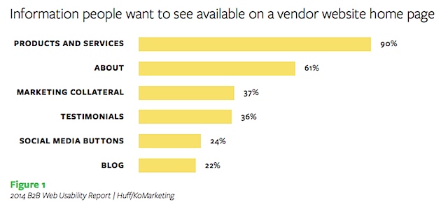
Homepage Expectations
90% of buyers want to see product/services information on vendors’ homepages.
Buyers also want to see about/company information (61%), marketing collateral (37%), and testimonials (36%).
Fewer buyers look for social media buttons (24%) or links to a blog (22%).
Why Buyers Leave Sites
Asked which website elements annoy them or cause them to click out of a page, most respondents (93%) cited video or audio that plays automatically.
Buyers also do not like animated ads that crawl across the page or pop ups (88%), lack of message/can’t tell what a company offers (83%), and lack of contact information (79%).
Today’s marketing strategy has been blown up with big data. Don’t get this wrong, data is important.
Image courtesy of Vlado / FreeDigitalPhotos.net
But the human emotional connection is what truly matters. If marketers are looking for the intelligent solution to today’s modern marketing, big data alone won’t be the “golden ticket.” Data alone promises a risk of an indelible letdown.
Getting the business needle moving takes a great brand development strategy and data research that brings precision to your relevant marketing. Data alone doesn’t motivate consumers to buy. Rather, the capability to read the mind of your customers will lead to the emotional connection that drives consumers to buy.
Credit: officenow / flickr.com
With modern-day marketers having a direct focus on big data, the emotional connection on which humans thrive is being pushed into the peripheral. RED is leading in this brand marketing strategy. Leaders know that true brand intelligence is centered between the head and the heart.
It’s a simple question: Do you need a style guide? And it has a simple answer: Yes. Any brand, company, blog or webpage that wants to create and maintain consistency and a professional feel should have a style guide.
Style guides are a must for any publisher with multiple employees. This is especially important if more than one person will work on any brand elements (from the website to printed materials), and to ensure that transitions between employees are seamless in the eyes of users. Today, we take a look at well-documented style guide from MailChimp, and highlight things you can take away in creating your own document for the first time.
What Is a Style Guide?
A style guide is the ultimate resource for visual and writing tone for your brand. The guidebook is not intended to be read cover to cover (and should not be written that way), and should be organized as a simple resource manual.
Style guides cover two big areas: visuals and writing. For website or app development, a style guide may contain a third area, defining how the user interface should work or coding specifics.
A style guide is a fluid document and once written should be updated regularly. When creating this document, consider how it will look and be used during the process. Your style guide should follow the styles defined. Use your brand’s color palette and the same writing style that you would like to be associated with the brand.
MailChimp’s “Voice and Tone” style guide follows this concept. The tone is simple and the guide looks and feels like the website. In addition, MailChimp also has a “Brand Assets” guide for how visual elements are used.
Getting Started
Creating a style guide from scratch is not a task that you can complete in an hour. It will take some planning and time. But once the document is created and if updated regularly, it can be a time-saver in the long run. Before you write the first word of instruction, gather (or create) this list of materials to make compiling your guide that much easier.
Branding definitions, styles and logotypes: This includes examples of how logos can and can’t be used, as well as fonts, sizes and color swatches.
Font palette: List all the typefaces, sizes and colors that are acceptable. Include specs for how each is used from styles for body type, headers, quotes, labels, captions, navigation elements and so on.
Images, icons and buttons: Define style, color, size and placement of each.
Styles for forms or calls to action: Define what type of information can be collected and how data collection works. Write and include disclaimer information.
Basic layout: What is the basic template for your design? Include a few examples for how your letterhead, printed materials or web pages should look.
Visual Style
The visuals section of the style guide includes several key parts: acceptable fonts and use, including normal, bold, italic and special styles; color and size for typefaces; settings for bullets or lists; color palette; and image guidelines, such as size, border specs and uses such as text wrap or image and text combinations.
These styles should be written in simple and clear language and include technical specs, such as complete font names, color mix swatches (in RGB, CMYK or Pantone) and usage guidelines for web and print (if applicable). Some brands have both a print and web style guide; other brands opt for one document that covers both.
MailChimp’s style for typography is direct and shows each font and usage. The style guide should include HTML specs as well for website styles. What elements use an H1 versus H2 versus H3 tag. (We’ll go into more detail about web specifics in the HMTL section.)
In addition, visual style guidelines should include a full description of when, how and where branding and logos can be used. This includes how the logo looks, if colors or fonts can be altered (typically not) and in what instances use is acceptable.
Writing Style
Just as important as your visual style is the tone of the writing. It can be jarring for users to come see your brand material and it read light and silly in one instance and cold and sterile in another. How the words come together can help clients or users associated with your products, making a writing style vital.
Key parts of written style include tone; spelling and language; reader level or jargon; voice; structure; use of symbols, numbers and lists; branding or trademark usage; and overriding style guide of choice.
There are a handful of generally accepted written style guides for English-language publications. Most company style guides direct you to use one of these for questions on matters of usage and style.
AP Style: The Associated Press Stylebook is used by journalism and writing professionals in print and online. The style focuses on consistency and brevity and is common because of these attributes.
Chicago Style: The Chicago Manual of Style is used by academics and for scholarly works, businesses and includes the basics for a more formal style of writing.
MLA Style: The Modern languages Association style guide is most commonly used in academics, liberal arts and humanities.
MailChimp’s writing style guide includes great examples of press releases and how the site should read as well as how the brand interacts with customers on social media, the blog and how the company’s trademark jokes should be handled.
User Interface and HTML
If you are creating content for the web, you need rules for digital publication as well. While text, color and tone guidelines will be outlined in other guides, you should also note how the website and user interface should work. (The PRL guide is an excellent resource.)
Text: Explain HTML markup rules. What type of headers are used and how? What’s the difference in usage between an H2 or H3? In addition to usage, what markup does your site use? This is the part of the guide that details every usage.
Images: The rules for image use should be just as clear as for text. Do you have a specified width or height for every image? Is there a standard text wrap or border size? How should alt tags be used. Make sure to answer each of these questions clearly.
Naming and saving files: In addition to how things should look, consider a little web housekeeping. How should files be named and saved in the CMS? Set clear guidelines so that your file maintenance is clean and files are saved at manageable sizes and are easy to find.
Coding practices: Determine and set forth coding standards for HTML, CSS and JavaScript. Include examples.
User Interface: If you did not include a visual guide for user interface elements and workings, include it here. What types of inputs are used and how are they labeled? (Do you use words like “Continue,” “Submit,” or “OK?”) Include a “kit” of your site’s user interface elements and usage.
In Conclusion
The best way to get started with creating a must have style guide is to contact:
Millennials, individuals aged 18 to 33, are a less religious, home buying, bank hating, selfie loving, liberal and mystifying generation. Just when it seems as though the millennials are figured out, a new selfie is posted, or a political choice is made, and people are left scratching their heads.
Millennials are less religious than previous generations. In fact, almost two-thirds of millennials would not classify themselves as religious. This may be related to the marrying trend of millennials, with only one in four millennials being married.
Millennials are buying homes, and this is changing things up for real estate agents who are not used to the millennials’ ways. 79 percent of first-time home buyers last year were millennials. Some real estate agents find their new young adult costumers to be a little mystifying. Millennials prefer texting, while real estate agents would rather pick up a phone, or have a face to face meeting.
Another mystifying fact about the millennial generation; they are against banks. In fact, they think that banking will be so different in five years that banks will no longer be necessary. In a poll of 10,000 millennials done by Scratch, banks made up four of the top ten most hated brands. Three-quarters of the millennials polled feel that they would be more interested in financial services that were offered by companies such as Apple, PayPal, Square, Amazon, and Google. What does this mean for banks? They need to step it up and figure out how to please millennials.
Who loves a selfie more than a millennial? Millennials are two times more likely to have shared a selfie than any other generation. Just a glance at Facebook or Instagram will show how obvious this is. This does not mean that millennials are self-absorbed though, a surprisingly high percentage, 63 percent, feel that it is their duty to take care of an aging parent. So while the millennial generation may be mystifying, they are a caring generation.
How do millennials identify themselves politically? Half of the millennial population are political independents. They are more likely to vote liberally than conservatively. Only 31 percent of millennials even feel that there is a significant difference between Republican and Democratic parties.
Millennials love technology, so it might be surprising to learn that 50 percent of households without televisions are millennial households. They do however watch programs on their mobile devices.
Millennials are on the lookout for a bargain, and are educated on how to get the best deal. 31 percent of all millennials shopping money is spent on deals.
What does all of this mean? It means that things are going to have to change. As millennials grow into adulthood and venture out more into the world, businesses are going to have to adapt in order to better appeal to millennials. Real estate agents and mortgage companies may have to be innovative with new practices. Companies may need to find a way to work out great deals, and perhaps post them on social media with a few selfies. Banks, especially, need a major overhaul in order to stay competitive with the millennial market.
Millennials might be a mystifying generation to some, but they are the generation of the future. They will make and demand changes. A better understanding of what makes up their generation will help everyone navigate these new changes.
Original Opinion / Ashley Campbell
Source / guardianlv, Forbes, CBS News, Philly.com, Fast Company, The Week, PBS Newshour
The tectonic plates that underpin our marketplace are in the midst of a large shift…and brands should be paying attention. As the Millennial Generation quickly becomes the primary force in consumer spending, our marketplace is shifting from a transaction based economy to a participation based economy.
The primary thought-currency no longer has a commoditized value, but instead, a perceived value. Customers base decisions on an entirely different set of criteria: They don’t just want to buy your brand, they want to be a part of it.
To quote the great Bob Dylan, “The Times They Are a-Changin.’”
The Transaction Model
In the transaction model, brand value was defined in transactional terms. The formula looked something like this:
This model told us that the functional benefits of our product or service were of primary concern to the end user. In short, utility was king.
This type of thinking spawned a primarily interruptive style of brand development. After all, when consumers are faced with a direct apples to apples (A to A) choice, the squeakiest, loudest, most present and most disruptive voice wins. Brands were rushing to interrupt potential customers to prove the utility and benefit of their offering. All of this utility proofing geared toward one objective — the transaction.
Brand value, as a result, was defined by converting interruption into transaction. The “proof is in the pudding” thinking cemented itself at the core of brand development —great branding created transaction. As the economic landscape shifts, the interruption to transaction model is becoming obsolete.
The Participation Model
As Seth Godin put it, “Relying too much on proof distracts you from the real mission–which is emotional connection…Selling to people who actually want to hear from you is more effective than interrupting strangers who don’t.”
In the participation model, brand value is defined in relational terms. The Participation model looks something like this:
This type of thinking tells us that functional benefits and emotional benefits are amplified by our willingness to include our customer in the experience. Participation represents an invitation. An invitation for co-creation, co-responsibility and co-delight. Participation gears toward one objective —the experience.
The direct apple to apple (A to A) comparison becomes an experiential comparison: Apple experience to apple experience (AE to AE). It looks beyond interruption and way beyond transaction. In the participation model, great branding invites participation.
Jeff Fromm summed it up well by saying, “Millennials want to co-create the products and services you sell, the customer journey and the marketing and social media.”
A Case Study For Participation: Apple
(Yes, I know it’s trite to use Apple as a case study, but in this instance, this really is the best example.)
This can’t solely be attributed to truly disruptive tech releases. In fact, from 2007-2008 (the release of the iPhone), Apple’s brand value ranking only jumped 9 slots (from 33rd to 24th). So what took Apple’s brand value from $13,583m to $98,316m in 5 years? A potent combination of the rise of the participation economy and the fact that Apple’s core promise is participation.
Think about it, their entire model is centered around the invitation of participation. Participation from independent third parties (apps, hacks, media); participation from partner industries (music publishing, cellular carriers, media producers); and, most of all, participation from their customers.
Apple exemplifies the participation model by placing participation at the nexus of everything it does.
Beyond The Transaction
How are you moving beyond the transaction? How are you being participation-minded? How does your brand’s co-relationship deepen and grow before and after you make a sale.
If your brand development and sales funnel end at transaction, it’s time to start thinking about the participation model.
It used to be that marketing was segmented into two categories; business-to-business (B2B) or business-to-consumer (B2C). This was done (I assume), to separate specialties, audiences and segments in an effort to more highly target the groups of people who ultimately would consume a brand’s message.
What it really did, however, was create an unnatural language for marketers – with words like “synergy” and “speeds and feeds” – to tell the stories of products to their buyers and partners. It’s become like one massive game of telephone, where by the time a message gets to the person actually buying the product, the things that make it special have been swallowed by marketing vernacular.
Consumers are confused. Why can’t we make it simple for them to understand what we’re selling, to share their experiences and the value they felt with others? More importantly, why is it that what we’re marketing most often does not align to actual consumer experiences?
The fact is that the lines are so far blurred now between the two marketing segments that it’s hard to differentiate between the two anymore. We all need to think like the consumers we are, putting ourselves in the mindset of the buyer instead of trying to speak such an intensely sophisticated language full of acronyms and big words, in order to sound smarter.
Marketing increasingly strives to become one-to-one, with solutions to collect and wrangle the big data about us to serve up more personalized offers and experiences. On the other hand, social has become a more public and vast medium, where the things we share skyrocket quickly to a “one-to-many” experience. The dichotomy between marketing and social has actually flipped… and it’s out of balance. Social and marketing need to work together to personalize individual conversations, as well as deliver shared global experiences that crowds of common values can benefit from. This is what our social and digital mediums have gifted us, and how humans interact and feel more compelled take action.
So, this is how I see it:
Businesses do not have emotion. People do.
People want to be a part of something bigger than themselves.
People want to feel something.
People want to be included.
People want to understand.
But people are also humans, and with that comes mistakes. Missteps. Failures. As humans, it’s in our nature to say the wrong thing, get embarrassed, and not realize the consequences of our actions. The rise of social media has given a digital platform to the dark side of anonymity, both as individuals and as crowds. I say it’s time to lay down the virtual pitchforks and torches and bring this behavior back into balance. The delightful side of humanity holds with it empathy, understanding, and forgiveness, and when remembered in our communication, it ties us together as a common group.
Communication shouldn’t be complicated. It should just be genuine and simple, with the humility and understanding that we’re all multi-dimensional humans, every one of which has spent time in both the dark and delightful parts of life.
That’s human to human. That is #H2H.
KEY TAKEAWAY: Human beings are innately complex yet strive for simplicity. Our challenge as humans is to find, understand and explain the complex in its most simplistic form. This means you, marketers. Find the commonality in our humanity, and speak the language we’ve all been waiting for.